When creating posters or designs for packaging—like donation boxes or event displays—visual clarity and impact are essential to effectively communicate your message. A design may have good intentions, but poor visual execution can reduce its impact, confuse viewers, or fail to grab attention. Let’s explore some common design issues and how to fix them for a more polished and functional result.
1. Hierarchy and Legibility
The Problem:
- In designs where multiple words or elements are layered together, it’s easy for the message to get lost.
- Poor contrast between the background and text, or overlapping words, can cause confusion, making it hard for viewers to quickly understand the purpose of the poster, banner or box.
The Fix:
- Visual Hierarchy: Use size, weight (boldness), and color contrast to prioritize the most important words or ideas. For example, the largest text should convey the main message or action you want viewers to take.
- Spacing: Avoid letting text elements overlap or fight for attention. Clear space ensures each word or phrase can stand on its own.
- Readability: Always test your text for legibility from a distance, as people often view posters or donation boxes from across a room or while walking by.
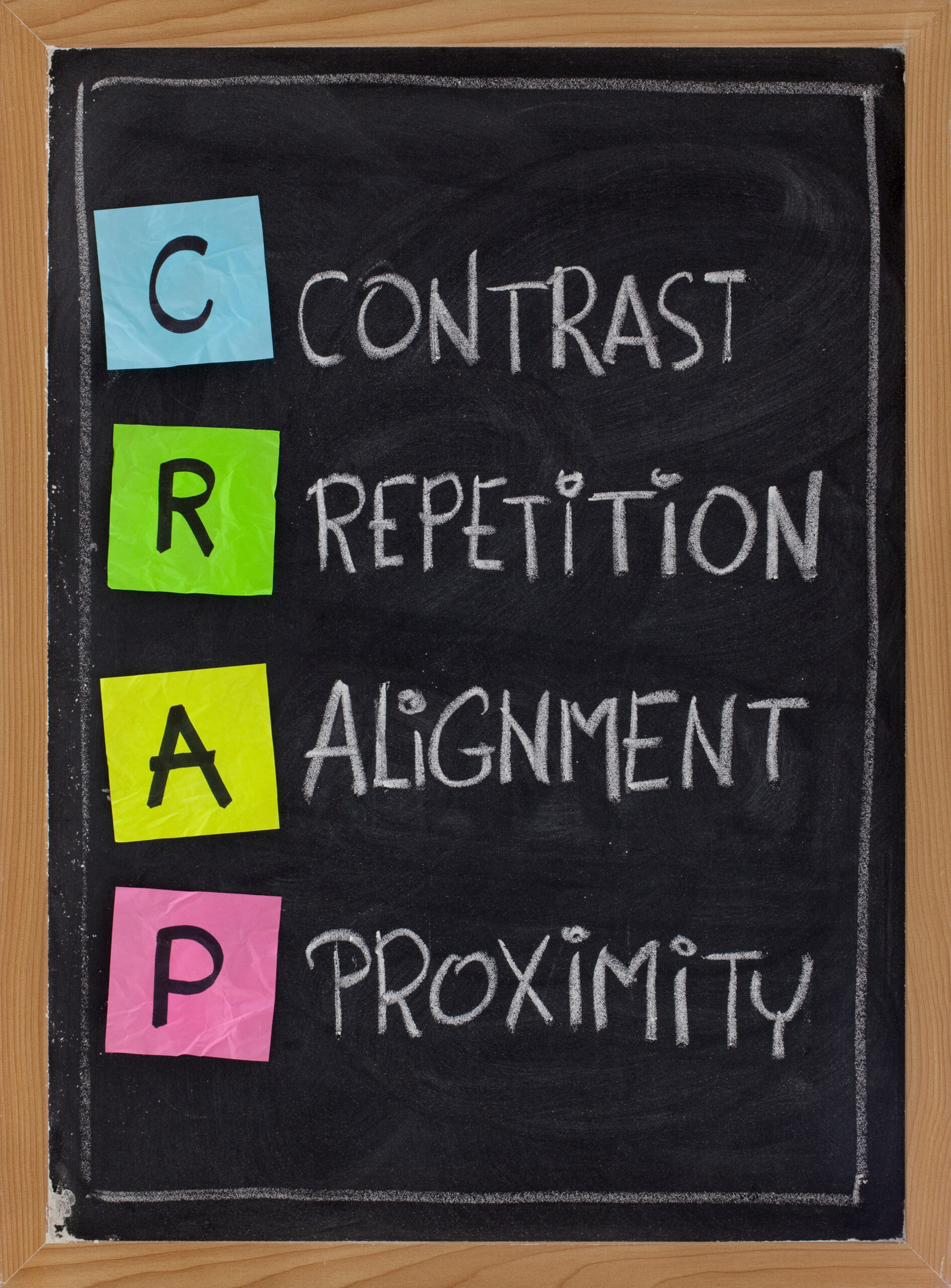
2. Contrast and Color Choice
The Problem:
- Insufficient contrast between text and the background (such as white text over a light-colored pattern) can make words blend in and appear invisible.
- Overusing similar colors makes it hard to differentiate between layers or key elements.
The Fix:
- Use contrasting colors that stand out against the background. Dark text on a light background or vice versa is a tried-and-true solution.
- If patterns or graphics are part of the background, reduce their opacity or simplify them to avoid competing with the text.
3. Visual Balance and Placement
The Problem:
- Unbalanced layouts can make a design feel awkward or disorganized. For instance, placing bold elements in random areas may confuse the eye rather than guide it naturally.
- Misaligned text or inconsistent spacing creates visual “noise,” which reduces the design’s overall professionalism.
The Fix:
- Align text and elements consistently. Use grids to organize where items are placed and ensure balance across the design.
- Group related ideas together so they feel connected visually and are easier to process.
4. Simplicity and Focus
The Problem:
- Too many fonts, styles, or colors can overwhelm viewers and dilute the message.
- Adding unnecessary decorative elements can distract from the core purpose of the poster or box.
The Fix:
- Stick to one or two fonts for consistency and readability. Vary font sizes, not styles, for emphasis.
- Limit the use of bold colors and effects, focusing only on the most important aspects of the message.
- Remove any elements that don’t contribute to the goal. Sometimes less is more!
5. Purposeful Design for the Setting
The Problem:
- Whether it’s poster designed for a small space or a banner or a billboard all need to work from different angles, distances, and levels of visibility. If the design doesn’t adapt to its environment, people may overlook it.
The Fix:
- Ensure the text is large enough to read from a distance.
- Avoid placing critical details in areas that could get folded, cut off, or obscured (like box edges in packaging).
- Think about the audience’s perspective: Will they see this while walking by or standing still? Are they reading instructions on the packaging before they remove the wrapper?
Final Thoughts
Design should always support the message, not distract from it. By improving hierarchy, contrast, balance, and simplicity, you can ensure your poster or box design communicates clearly and effectively. Great design isn’t just about looking good—it’s about getting people to see, understand, and act on your message.
Whether for charity, an event, retail sales, in print or online a clean, purposeful design will always have a greater impact.